Selected Work

Four cases

Four cases, at three distances from the work. In the first, the organisation is mine and everything in it was my decision. In the second, the team I built shipped it, and the designers on it did the designing. In the third and fourth I designed the products myself. Two products a decade ago, one at scale and one from nothing, and two AI products this year with nobody else in the room.

Design leadership at this level is mostly the first two. The last two keep my judgement current.

THE BUSINESS BEHIND THE WORKTHE WORK

Case one

The organisation

Toyota Connected Europe  ·  2018 to 2026

Everything here is mine. Built from nothing, run for seven years, sold engagement by engagement.

Case two

What the organisation shipped

MyToyota and Lexus Link+  ·  2023 to 2026

The team I had built was already in place, run by two design managers with the client's trust.

Case three

Two products, two markets

Songkick and Dopay  ·  2008 to 2018

Eight years at Songkick from seed to the Warner Music Group acquisition, then Dopay from concept to a live service. On both I designed the product myself and built the design team around it.

Case four

Two AI products, built alone

PrepCall and Emotrix  ·  2026

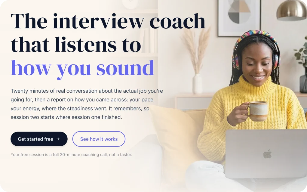
PrepCall, an AI voice coach I designed, built and shipped myself. Emotrix, the interpretation layer that came out of it, now in a live pilot under NDA.

Toyota work is shown at the level it can be shown publicly. Internal commercial figures and unreleased interface work are held back. Happy to go deeper in person.

Case One  ·  the organisation

Building a design organisation, then widening what it was allowed to own

Toyota Connected Europe  ·  2018 to 2026

Head of UX and Product Design, Toyota Experience Design (TXD). Built from nothing, run for seven years with full P&L.

0 to 40+

designers across six disciplines

£10m+

annual internal revenue at peak

1 of 3

recognised core competencies of the business

#1

permanent retention rate in the company

The challenge

Toyota Connected Europe had no digital design capability. Products moved through waterfall cycles with no consistent research, no discovery and no experience ownership. Design was bought in from agencies and treated as a downstream service, called in after the decisions had already been made.

The brief I gave myself was to make design a thing the business could not run without.

My role

I built the function from nothing and ran it for seven years, with full P&L accountability, across Europe, Japan and North America. I was accountable for every hire, and I sold every engagement the team worked on.

Commercial accountability

Design becomes a core competency or it becomes a cost line, and the difference is whether design leadership can talk about margin as fluently as it talks about craft.

I ran the function on a full P&L, at £10m+ of annual internal revenue at peak, and every designer I hired was paid for by an engagement I had won. A published service catalogue and explicit positioning meant partner teams bought the depth they needed.

Our largest programme closed overnight, taking its revenue and team structure with it. I ran a structured retrospective that turned the wind-down into a documented reassignment method, and it became the standard for every client transition that followed.

How the capability grew

Service design did not exist anywhere in Toyota that I could find.

When I arrived, the app belonged to the marketing and growth side of the business, which had handed the whole thing to an agency. No UX research had been done. My team's first job was UI design in support of Connected Technologies, the product division TXD served as an internal client.

MyToyota, the home screenUS build, public app

Case one · the sequence

2018  →  2026

How the capability grew

Five capabilities in the order they were established.

First

UI design

Screens for flows that business analysts and product managers had already written, in support of Connected Technologies.

Earned → a place inside the product teams.

Second

UX design

When the app passed into Connected Technologies’ ownership, the flows came with it.

Earned → the flows themselves.

Third

UX research and analytics

The same people were wireframing without knowing what users did.

Earned → evidence, and with it the right to frame the problem.

Fourth

Product design

The team moved closer to the core business.

Earned → a close enough view of the business to see what it could not see.

The question changed

Fifth

Service design

Connected Technologies owned the app in full and had to work with the rest of Toyota in Europe. Nothing like it existed anywhere in Toyota.

Earned → the joins between business units that nobody owned.

Scope: one screen

Scope: the business behind it

Each capability earned the next. By the end the team sat inside quarterly planning, and its research and service design shaped where the business went next.

Left to right is seven years. The band beneath is how much of the customer’s experience design was allowed to own, from one screen to connected vehicle apps, in-vehicle multimedia and EV.

Case one · the sequence

How the capability grew

Five capabilities in the order they were established. The bar under each is how much of the customer’s experience design was allowed to own, from one screen to connected vehicle apps, in-vehicle multimedia and EV.

First

UI design

Screens for flows that business analysts and product managers had already written, in support of Connected Technologies.

Earned → a place inside the product teams.

Second

UX design

When the app passed into Connected Technologies’ ownership, the flows came with it.

Earned → the flows themselves.

Third

UX research and analytics

The same people were wireframing without knowing what users did.

Earned → evidence, and with it the right to frame the problem.

Fourth

Product design

The team moved closer to the core business.

Earned → a close enough view of the business to see what it could not see.

The question changed

Fifth

Service design

Connected Technologies owned the app in full and had to work with the rest of Toyota in Europe. Nothing like it existed anywhere in Toyota.

Earned → the joins between business units that nobody owned.

Each capability earned the next. By the end the team sat inside quarterly planning, and its research and service design shaped where the business went next.

Where service design came from

Service design came out of that ownership. Once Connected Technologies owned the European companion app, the points either side of it belonged to other divisions and nobody was accountable for the joins. Working with those divisions is what made service design possible to introduce.

A disjointed end-to-end experience is usually a faithful reflection of a disjointed business.

What it led to

So I made the case for service design, and hired service designers into a company that had never employed one.

The team’s work

What they went on to build, blueprints, reusable service patterns and playbooks, mattered less than what it did to the conversation. Business units that had never designed anything together started working on the same journey.

They are still doing it. Colleagues running design in Toyota North America asked how I had got it established, and were unable to replicate it in their own.

Leading at a distance

I stepped out of the daily craft early and on purpose. The split is below.

When executives wanted to understand a specific change, I brought the designer who had made it. Their accuracy, their ownership, their exposure to leadership.

The service catalogue, once the team was fully formed. Three practices, from concept to market.Toyota Experience Design, internal

Case one · leading at a distance

What I owned, and what my design managers and leads owned

This is how the split ran day to day.

The organisation ran in three layers. I sat above two design managers, and the design leads sat inside each product team. I wrote this split down and agreed it with my design manager so we both knew where the line sat.

I owned

The standard, the strategic context, the operating model

The quality bar, held at review points

The investment, the protection of time, the cover for hard calls

Seeing the problems early, and putting the right people on them

The client relationship at executive level, and the governance behind it

New business across the Toyota ecosystem, and the design relationships in North America and Japan

Financial performance, and resourcing across every engagement

My design managers and leads owned

The daily design decisions

The craft end to end, and the reviews and critiques behind it

The customer-facing detail

Resourcing inside the engagement

The day-to-day client relationship, and the monthly report back

New work inside the accounts they already ran

Growing the people on their teams

We held some of it together.

Held together

Strategic planning, and the decisions that shaped the team

Client satisfaction and the standard of what we delivered

Team culture and career development

Design quality and how the process improved

When delivery risk, a stakeholder conflict or a resourcing problem went past what a manager could settle, it came to me.

How each role was measured

What I was measured on: revenue growth and new business, budget and resourcing across all engagements, talent retention, the maturity of the practice

What they were measured on: project profitability and utilisation, client satisfaction and delivery, team performance and individual growth, design quality

The app team in case two ran on the same split.

Growing people

The organisation grew from two people to over 40. I was accountable for that growth and built the structure it happened inside, and my design managers ran the teams day to day and made most of the hires. Two progression pathways, written expectations at every level, and a framework leadership endorsed as aligned to global talent strategy.

The function held the highest permanent retention rate of any department in the company. I shifted it from roughly half contract to two thirds permanent without growing headcount. Several of the team describe it as the best team they have worked in.

Case one · growing people

Hiring, progression and retention

Progression before scale, a listening cycle that closed the loop, and a shift from contract to permanent at the same headcount.

Two pathways, one framework

Junior designerMid designerSenior designerUX RESEARCHPRODUCT DESIGNSERVICE DESIGNDESIGN SYSTEMSCONTENTPrincipal designerLead designer, practiceLead designerDesign managerHead of designPRACTITIONER LEADERSHIPPEOPLE LEADERSHIP

Listening that closed the loop

185pieces of feedback across six themes, one annual cycle
Career progression55
Role clarity33
Team goals29
Performance evaluation28
Organisational direction26
Resources11

Fourteen initiatives across three horizons, each with a named owner and each traceable to the line that prompted it.

Contract to permanent, at the same headcount

Roughly half permanent, when the shift began

Permanent
Contract

Two thirds permanent, at the end

Permanent
Contract

The highest permanent retention rate of any department in the company.

Redrawn from the framework. Level codes and the document itself stay internal.

Position and innovation

We got design into the Connected Technologies strategy team, which owned the first gate of the delivery pipeline. Strategic research and service design became the entry condition for any product or service idea, and roadmaps and investment decisions started from the problem set my team curated.

I built the strategic case for a federated global design system and took it to executive level, one of two design system initiatives across Toyota worldwide.

A principal designer on my team asked whether he should run two days of idea generation for a worldwide Toyota AI initiative that Toyota Connected Europe had decided not to take part in. I told him to go ahead. I knew what he was capable of, that he would bring product and engineering in alongside design, and that the time would be well spent. Seeing what someone can do and giving them the room is a large part of the job. Three approved proposals came out of it, and around £3.5m of projected investment from Toyota's global AI fund. On the strength of what came back, Toyota Connected Europe entered the initiative it had declined. The wider programme generated 29 ideas, and eight are being pursued by Toyota globally.

What changed

Design displaced the incumbent agencies and became one of three recognised core competencies of the business. The chief executive of Toyota Connected Europe called the team "the hidden jewel of the business". The team, the framework and the service design capability are all still there.

Case Two

A US app in Europe, from 1.9 stars to 4.6

MyToyota and Lexus Link+  ·  2023 to 2026

I ran this team myself for three or four years, then put design managers in my place as the function scaled. The rebuild is their work and the work of the designers under them.

2,321

users surveyed before a screen was redrawn

4 rounds

of usability testing, funded and held to target

1st

design system in any Toyota app globally

13 months

complaint driver to differentiator

The challenge

When the US app came to Europe, the team was already in place. It had UX research running, a deep understanding of the European app being replaced and of the European customer, and three to four years inside Connected Technologies' product organisation. The app landed at 1.9 stars. Design dominated the complaint list: navigation customers could not learn, information displays they could not read, no dark mode, driving analytics nobody understood, and an EV experience scattered across four places. For European customers it felt like a step back from the app being sunset.

An organisation is only as good as what comes out of it.

Who designed it

For the first three or four years I ran this team myself, as design manager for our largest engagement while also holding the Head of Design role. When the function and the other engagements scaled, I could no longer do both, so I hired a design manager into the seat I had been holding, and later a second for our North American engagement. When that engagement closed, the second manager took over the app team. From then on they ran it day to day, with design leads and a design system manager under them, and they had the client's trust because they had earned it.

In my first years at Toyota I designed the UX and UI of the previous European app myself. I did not design the rebuild. What I held was the engagement itself, the relationship and governance with Connected Technologies, the resourcing and the financial performance, the quality bar at review points, and the shape and size of the team year on year. I had been raising My Garage as a problem for some time before the rebuild. The EV problem was understood jointly by the Connected Technologies product team and my designers, and what my design managers and I did was put the right people on it. Everything downstream of that was theirs.

What that involved

Research already in place.

By the time the US app arrived the team had UX research running inside the app organisation, which I had argued for years earlier. A lead UX researcher we had hired ran four rounds of moderated usability testing on the same tasks, with a research team of contractors covering different research skills. By then the value of research was accepted and the lead had the trust and scope to do the work. The redesign did not ship until task completion hit its target.

Two problems, and who saw them.

I had been raising My Garage as a problem for some time. The EV problem was framed jointly by the Connected Technologies product team and my designers in the EV workshop. My design managers and I staffed it. Both solutions were the team's.

Rebuilt with a design system underneath.

The design system manager on my team made the case for a design system as part of the rebuild and sold it to Connected Technologies, who funded it. He had the agency and autonomy to own it. Over six months he defined what the US app needed to meet European expectations, and the team built the design system into the rebuild at the same time, design system thinking and front-end architecture together. The first design system in any Toyota app globally, multi-brand across Toyota and Lexus, with accessibility governed ahead of the European Accessibility Act.

What the team designed

The team rebuilt the app for European customers. The home screen was redesigned around the tasks people came for, EV charging was brought into one place with live status, and a design system was built underneath both. The chart is their testing and the phone is their home screen.

Four rounds of user testing, the same tasks each round

System Usability Scale scores from four rounds of moderated testing on one set of EV tasks.

737980TARGET 86GLOBAL AVERAGE 68

Round 1

Round 2

Round 3

Round 4

90

75

60

Four rounds on one task set, moderated, with a team of contract researchers.

Three reported SUS scores. The fourth round was run to task-completion target.

Home, as the team rebuilt it.MyToyota, Europe

One finding, and what it taught

In testing, 92 per cent of participants completed the charge scheduling task and rated its ease at 5.15 against a benchmark of 5.5. The task passed on the numbers, and the sessions still showed a problem. The control that set the schedule said nothing about its outcome, so people set it and could not tell what they had done. One change, a control that states what it will do, served new users and advanced users alike.

Case two · the outcome

Internal customer-experience reporting, Jul 2024 to Aug 2025

Thirteen months from complaint driver to differentiator

Design dominated the complaint list when the repurposed app landed. Then it left the list altogether.

INSIDE THE TOP FIVE COMPLAINT CATEGORIESOUT OF THE TOP FIVE

2024

Design dominates the complaints

The deprecated US app lands in Europe at 1.9 stars. Navigation customers cannot learn, information displays they cannot read, no dark mode, driving analytics nobody understands.

Spring 2025

The language shifts

“Intuitive”, “simple and effective”, “very well thought out” start appearing in customer feedback where the complaints used to be.

June 2025

Design credited by name

An internal customer-experience report attributes reduced complaint volume directly to intuitive design. The first time on record that design was named as the cause of an improvement.

August 2025

Out of the top five

Displaced by backend and connectivity issues outside design’s ownership. The 4.6 star rating stabilises.

Case two · the rating data

The public rating data

The rating, and the share of reviews behind it.

At launch

1.9

August 2025

4.6

Rating more than doubled over thirteen months.

Share of reviews, by star rating

Before

1★  67%

19%

After

17%

5★  78%

One star

Two to four

Five stars

One star: 2 in 3 → 1 in 20

Five-star reviews grew nearly six-fold, and one-star reviews fell from two thirds of all reviews to five per cent.

Public App Store and Play Store data, about 43,600 reviews. Lexus Link+; MyToyota shows the same pattern.

What changed

I had brought AppFollow in during 2021 so the team could read how customers were experiencing the app, which is where the shift was measured. Within thirteen months the language in customer feedback moved from unintuitive and confusing to intuitive, simple and effective. In June 2025 an internal customer-experience report credited reduced complaint volume directly to intuitive design. By August 2025 design had dropped out of the top five complaint categories entirely.

The result came from a good design team, across UX research, product design, UI design and service design, that had earned the client's trust. That is what case one built.

Case Three

Two products, two markets, as designer and as leader

Songkick and Dopay  ·  2008 to 2018

Eight years at Songkick as employee number seven and VP of Design, on the executive team from seed through Series C to the Warner Music Group acquisition. Then Chief Design Officer at Dopay, taking a fintech for unbanked workers in Egypt from concept to a live commercial service. In both, I designed the product.

#7

employee at Songkick, from seed to acquisition

10m

monthly active users on Songkick

85%

adoption three weeks after Dopay launched

$18m

Series A that followed at Dopay

2008 to 2016

Employee number seven at the concert discovery platform, hired by the three founders after Y Combinator. I created the logo, the brand, the brand book and the visual language, and led product design across web, iOS and Android from a web-first launch to a mobile-first platform. The company grew to 130 people and 15 million users, and the platform scaled to 10 million monthly active users and over $100m in gross ticket revenue.

I built and led the design organisation, worked alongside the CPO on product strategy and on scaling the product organisation, and brought analytics and research, remote and in person, quantitative and qualitative, into how ideas were de-risked. The mobile-first strategy I drove delivered a 43 per cent increase in active users, with mobile passing 60 per cent of traffic. I oversaw design for the distribution partnerships with Spotify, YouTube, Facebook, SoundCloud and MTV.

  • Apple Editors' Choice
  • UK App of the Week
  • Webby Award, best music mobile site or app
  • Billboard App of the Month
  • Music Week Consumer Digital Service of the Year
  • Fast Company's fifth most innovative company in music
  • $16.6m Series C, then acquisition by Warner Music Group
Songkick on iOS.Shipped product

2017 to 2018

Chief Design Officer, London and Cairo, on a fintech delivering mobile payroll to unbanked workers in Egypt, where 67 per cent of the population had no bank account. Concept to live commercial service.

I directed the design and launch of the Dopay for Business platform and the iOS and Android employee apps, which reached 85 per cent adoption within three weeks of launch, and designed the physical Mastercard prepaid card that gave thousands of workers a first banking identity. I built the design practice and research operations from scratch. The product underpinned a €1m investment and an $18m Series A, with McDonald's Egypt and SWVL among the enterprise clients.

Dopay for Business and the employee app.Shipped product

Case Four

Two AI products this year, one shipped and one in pilot

PrepCall and Emotrix  ·  2026

I designed and built both on my own, and every decision in them is mine. PrepCall is live. Emotrix is in a pilot under NDA.

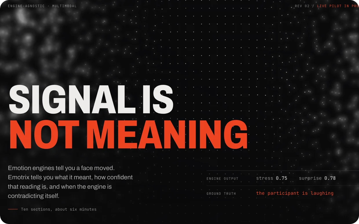
The reading. Five constructs against the participant’s own baseline, two interpreted lines above them, hatched where no reading is asserted.Emotrix, real interface, synthetic session
What the product does with it. The listening half of a coaching report. What was said, how it sounded, and one thing to try.PrepCall, live product

On the left, Emotrix reads emotional markers from face and voice together and plots what they mean across a session, against the participant’s own baseline. On the right, PrepCall reads the same kind of signal from voice alone and turns it into a coaching report. In both, the design work is the layer that turns a reading into something a person can act on.

Both run on Hume’s Empathic Voice Interface. Both built by me.

5.6k to 34k+

prompt characters, session one to four

20 min

live empathic voice conversation per session

Article 5

the EU AI Act rule that set the product's direction

2 products

designed and built, one live, one in pilot

The challenge

After twenty five years of directing design work, I could no longer say with confidence what good looked like when the system underneath was generative and probabilistic. I needed to build with it myself.

Voice and face engines now read hesitation, nervousness and confidence with real accuracy, and they hand that reading straight to a product with no idea what to do with it. I built two things this year to work on that gap. PrepCall answers it for one narrow case. Emotrix generalises it.

My role

I did all of it, on both products. Product strategy, the voice interaction model, every flow, the report architecture, the dashboards, the build on Hume's Empathic Voice Interface and the Anthropic API, the deployment, and the compliance work.

What the two products do

A signal and its meaning are two different things. A raised brow means one thing in a usability test and another in heavy traffic. A pause means one thing inside an interview answer and another while somebody is parking. The engines emit a reading. Something still has to decide what that reading means in this context before a product can act on it.

The thesis started inside Toyota. I authored the proposal to Toyota's Global AI Initiative for an AI-powered facial action coding system for in-cabin monitoring, and ran the internal accuracy testing behind it. The engines were accurate enough. The limit was context. PrepCall takes the narrow version, twenty minutes of live conversation on Hume's Empathic Voice Interface and a coaching report grounded in what someone said and how they said it. Emotrix takes the general version, an interpretation layer above the engines, engine agnostic by design.

emotrix.cloud, the page on method. The timeline is illustrative, hatched where the face was not resolvable.Live site, September 2026
PrepCall, the front page.Live product, September 2026

What I learned building it

The failure that taught me most.

Around the fourth session per user, quality started degrading and it took a while to see why. Everything was working. The system prompt had grown from roughly 5,600 characters at session one to over 34,000 by session four. Context accumulated until the model was drowning in its own history.

The fix was architectural.

A bounded prompt with hard character budgets, enforced however many sessions a user has had. Designing for a probabilistic system is largely this work, deciding what the model is allowed to carry. The interface is the easy part.

Regulation as a design input.

PrepCall coaches the candidate. Article 5 of the EU AI Act prohibits emotion inference in the workplace, so assessing someone on behalf of an employer was closed from the start. The regulation set the product's direction, and it was the right direction. I owned the compliance layer personally, including the classification and the data protection impact assessment.

A review interface for the interpretation layer.

Emotrix needed a way to see what the engines report and what the reducer makes of it, on one timeline. I designed and built the session review interface. Five construct lanes carry the raw readings, each scored against the participant's own baseline, with an emotion line and a cognitive load line above them. Where the face is lost the lanes are hatched and no reading is asserted. The flagged moments, the transcript and the observer's notes sit on the same axis, so any reading can be checked against its evidence.

Where Emotrix stands

Emotrix is a thesis with working software behind it. The interpretation layer is designed, the architecture is built, and the session review interface runs. A pilot is under way under NDA. Everything shown here is the real interface on a synthetic session, because the pilot data stays with the partner.

Where PrepCall stands

PrepCall is live with real users at prepcall.me. I built it to keep my own judgement current and to give the thesis a product to run in.

The year gave me a point of view on designing with AI that is my own. Seven years of leadership and a year of building. Most of what I now think about designing with AI comes from shipping it.

Governance

On PrepCall I made the Article 5 classification and wrote the data protection impact assessment myself. Article 5 of the EU AI Act prohibits emotion recognition in the workplace, so PrepCall coaches the candidate and never assesses anyone for an employer. The product is better for it. At Toyota I built the European Accessibility Act governance for the whole design function and turned compliance into a four-tier service. Everything in the first two cases was delivered inside regulated automotive programmes, and Dopay was a regulated payments product in Egypt.

EU AI Act, Article 5

Classification and the data protection impact assessment, on a shipped product

European Accessibility Act

Governance across a whole design function, turned into a four-tier service

Regulated delivery

Every programme in the first two cases, and Dopay as a regulated payments product in Egypt

The pattern

Find the thing that is broken, which is usually structural. Build the system that stops it recurring. Measure it in the language the business already uses. Then hand it to the people closest to the work and hold the bar.

The last part is the one people underestimate.

Much of what I am proudest of was designed by somebody else.

Contact

I'm looking for a VP, Head of Design or Design Director role in London, where design has to become a real function, and where the AI question is live. Available now.

Email gideonb@me.com, connect on LinkedIn, or download my CV.