Case Two
A US app in Europe from 1.9 stars to 4.6
I ran this team myself for three or four years, then put design managers in my place as the function scaled. The rebuild is their work and the work of the designers under them.
2,321
users surveyed before a screen was redrawn
4 rounds
of usability testing, funded and held to target
1st
design system in any Toyota app globally
13 months
complaint driver to differentiator
The challenge
When the US app came to Europe, the team was already in place. It had UX research running, a deep understanding of the European app being replaced and of the European customer, and three to four years inside Connected Technologies' product organisation. The app landed at 1.9 stars. Design dominated the complaint list: navigation customers could not learn, information displays they could not read, no dark mode, driving analytics nobody understood, and an EV experience scattered across four places. For European customers it felt like a step back from the app being sunset.
An organisation is only as good as what comes out of it.
Who designed it
For the first three or four years I ran this team myself, as design manager for our largest engagement while also holding the Head of Design role. When the function and the other engagements scaled, I could no longer do both, so I hired a design manager into the seat I had been holding, and later a second for our North American engagement. When that engagement closed, the second manager took over the app team. From then on they ran it day to day, with design leads and a design system manager under them, and they had the client's trust because they had earned it.
In my first years at Toyota I designed the UX and UI of the previous European app myself. I did not design the rebuild. What I held was the engagement itself, the relationship and governance with Connected Technologies, the resourcing and the financial performance, the quality bar at review points, and the shape and size of the team year on year. I had been raising My Garage as a problem for some time before the rebuild. The EV problem was understood jointly by the Connected Technologies product team and my designers, and what my design managers and I did was put the right people on it. Everything downstream of that was theirs.
What that involved
Research already in place.
By the time the US app arrived the team had UX research running inside the app organisation, which I had argued for years earlier. A lead UX researcher we had hired ran four rounds of moderated usability testing on the same tasks, with a research team of contractors covering different research skills. By then the value of research was accepted and the lead had the trust and scope to do the work. The redesign did not ship until task completion hit its target.
Two problems, and who saw them.
I had been raising My Garage as a problem for some time. The EV problem was framed jointly by the Connected Technologies product team and my designers in the EV workshop. My design managers and I staffed it. Both solutions were the team's.
Rebuilt with a design system underneath.
The design system manager on my team made the case for a design system as part of the rebuild and sold it to Connected Technologies, who funded it. He had the agency and autonomy to own it. Over six months he defined what the US app needed to meet European expectations, and the team built the design system into the rebuild at the same time, design system thinking and front-end architecture together. The first design system in any Toyota app globally, multi-brand across Toyota and Lexus, with accessibility governed ahead of the European Accessibility Act.
Case Two
One EV domain instead of four and it did not ship until it tested right
What the team built
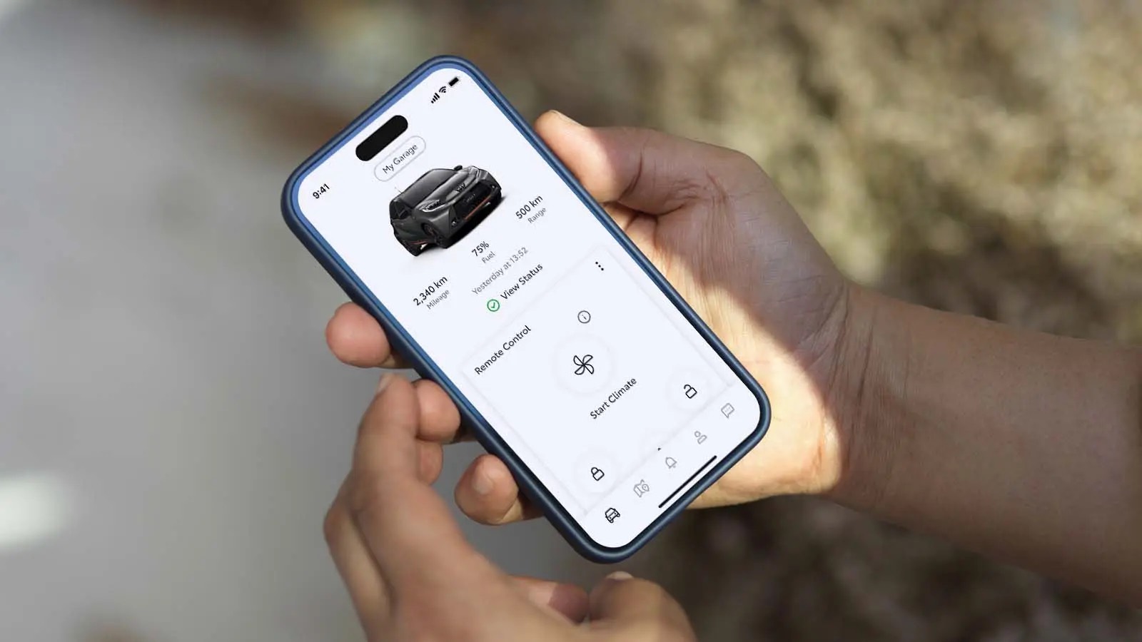
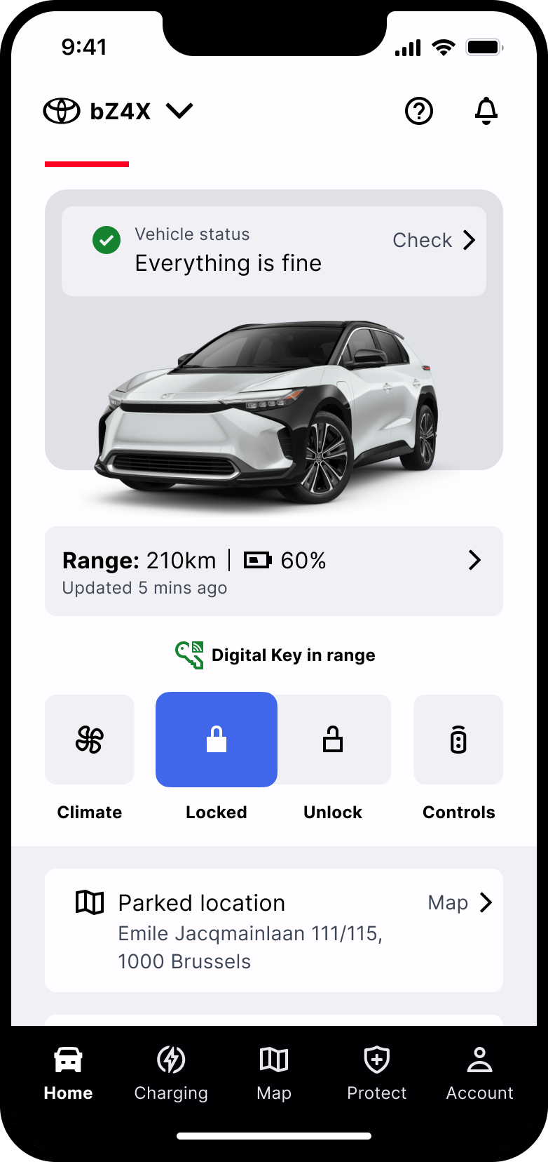
The team rebuilt the app for European customers. The home screen was redesigned around the tasks people came for, EV charging was brought into one place with live status, and a design system was built underneath both. The chart is their testing and the phone is their home screen.
Case two · what the team built
The team’s work
The EV experience, before and after
For an EV driver the questions are constant. Am I charged, can I leave, when will it be ready. The answers were scattered across the app.
Before · four places, one job
Home screen entry point, easy to miss
Battery status, tied to the default vehicle
Home charging, stored somewhere else again
Charging schedule, split across three settings
Grown feature by feature and vehicle generation by vehicle generation. Public and home charging history lived in different places. Charger-only customers saw no range at all.
After · one place, at the point of use
EV domain
Charging status
Live session
Schedule
Home and public
Real-time status, mirroring what is happening at the car.
The complexity of vehicle generations, home charger integrations and software constraints did not go away. The team moved it behind the experience rather than into the customer’s hands.
Everything shown here is the team’s work.
Case two · what the team built
The EV experience, before and after
For an EV driver the questions are constant. Am I charged, can I leave, when will it be ready. The answers were scattered across the app.
Before · four places, one job
01
Home screen entry point, easy to miss
02
Battery status, tied to the default vehicle
03
Home charging, stored somewhere else again
04
Charging schedule, split across three settings
After · one place, at the point of use
EV domain
Charging status
Live session
Schedule
Home and public
Real-time status, mirroring what is happening at the car.
System Usability Scale, by round
System Usability Scale scores from four rounds of moderated testing on one set of EV tasks.
Round 1
Round 2
Round 3
Round 4
90
75
60
68 is the average SUS score. 73 is a B minus. 80 is an A minus.
Three reported SUS scores. The fourth round was run to task-completion target. Curved grading scale, Sauro and Lewis, MeasuringU.
One finding, and what it taught
In testing, 92 per cent of participants completed the charge scheduling task and rated its ease at 5.15 against a benchmark of 5.5. The task passed on the numbers, and the sessions still showed a problem. The control that set the schedule said nothing about its outcome, so people set it and could not tell what they had done. One change, a control that states what it will do, served new users and advanced users alike.
Case two · the outcome
Internal customer-experience reporting, Jul 2024 to Aug 2025
Design in the top five complaint categories, 2024 to August 2025
Design dominated the complaint list when the repurposed app landed. Then it left the list altogether.
2024
Design dominates the complaints
The deprecated US app lands in Europe at 1.9 stars. Navigation customers cannot learn, information displays they cannot read, no dark mode, driving analytics nobody understands.
Spring 2025
The language shifts
“Intuitive”, “simple and effective”, “very well thought out” start appearing in customer feedback where the complaints used to be.
June 2025
Design credited by name
An internal customer-experience report attributes reduced complaint volume directly to intuitive design. The first time on record that design was named as the cause of an improvement.
August 2025
Out of the top five
Displaced by backend and connectivity issues outside design’s ownership. The 4.6 star rating stabilises.
Case two · the rating data
The public rating data
The rating, and the share of reviews behind it.
At launch
1.9★
→
August 2025
4.6★
Rating more than doubled over thirteen months.
Share of reviews, by star rating
Before
After
One star
Two to four
Five stars
One star: 2 in 3 → 1 in 20
Five-star reviews grew nearly six-fold, and one-star reviews fell from two thirds of all reviews to five per cent.
Public App Store and Play Store data, about 43,600 reviews. Lexus Link+; MyToyota shows the same pattern.
What changed
I had brought AppFollow in during 2021 so the team could read how customers were experiencing the app, which is where the shift was measured. Within thirteen months the language in customer feedback moved from unintuitive and confusing to intuitive, simple and effective. In June 2025 an internal customer-experience report credited reduced complaint volume directly to intuitive design. By August 2025 design had dropped out of the top five complaint categories entirely.
The result came from a good design team, across UX research, product design, UI design and service design, that had earned the client's trust. That is what case one built.
The other cases
Contact
I'm looking for a VP, Head of Design or Design Director role in London, where design has to become a real function, and where the AI question is live. Available now.
Email gideonb@me.com, connect on LinkedIn, or download my CV.